Home
About
Contact
Ideation
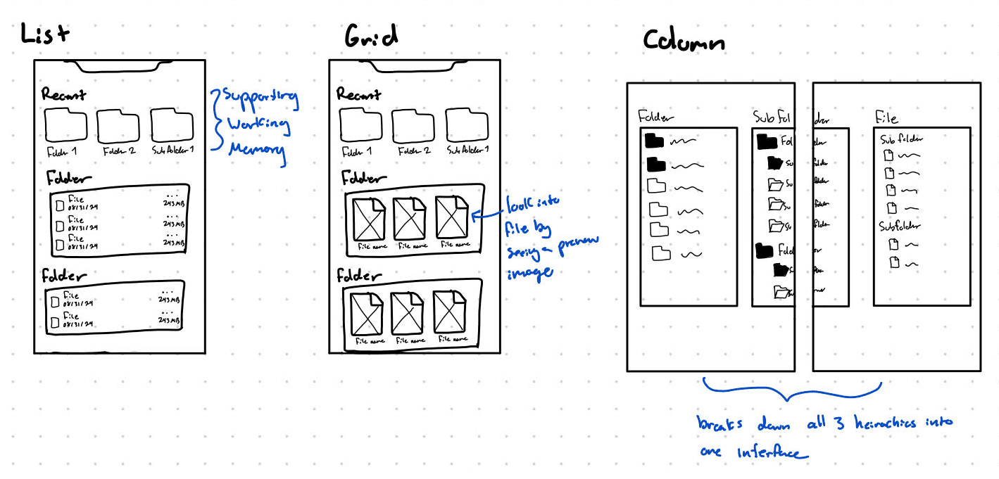
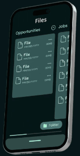
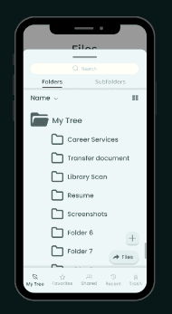
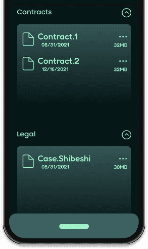
Due to the mobile interface having much more interactions to account for than a desktop interface I wanted to configure the application to take advantage of those interactions to better the UX for mobile users.
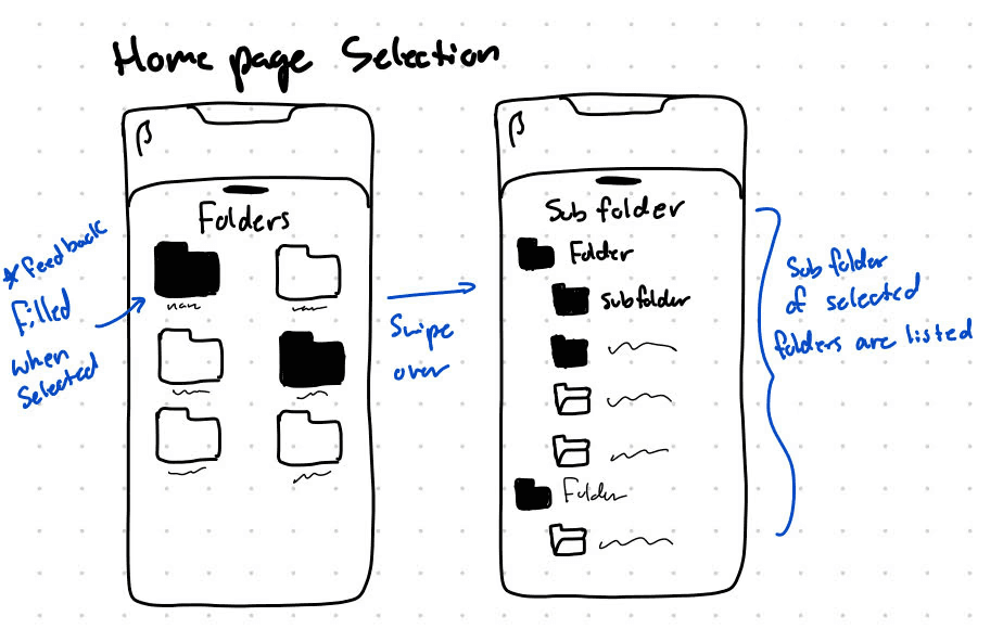
Some of the interactions I considered in my design was swiping, zoom in/zoom out, and double tap. After trial and error and a bit of user research we found the swiping feature to work the best for the user intentions of browsing, locating, and managing files and folders.
Branding
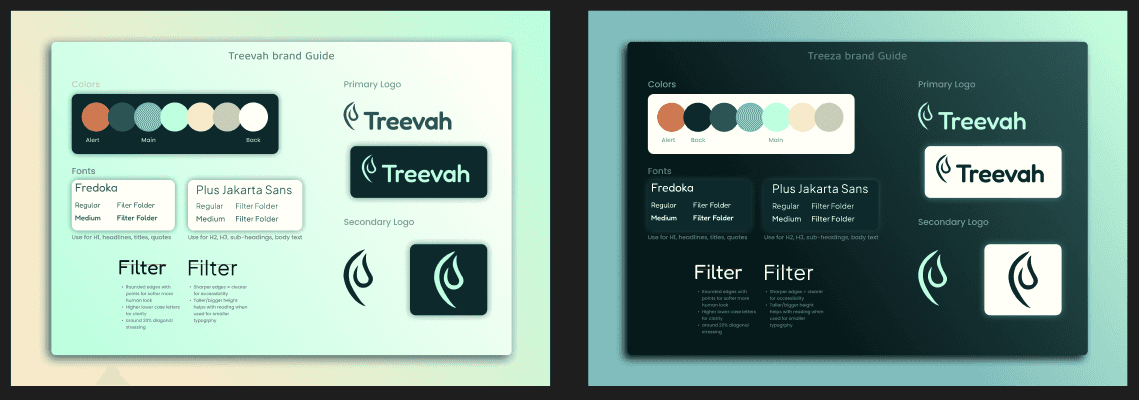
Being a startup, Treevah had little to no branding for their product and marketing
I found the best combination came from scaling down the bright logo colors to a pastel while occasionally incorporating brighter colors from the original scale. I also hand drewthe secondary and Primary logo custom logo for marketing and Product use.
Accessibility
I voiced concerns with design decision and UI element that didn't always align or consider accessibility, ensuring the final product catered to a larger group of users.
Due to the complexity of Treevah's hierarchy system and the learning curve that is required to get starting with the application, accessibility was our main focus in tone and organization for the app's launch. In the design of the website and the app itself my priory as a project manager was ensuring the product was easy to understand.
Problem
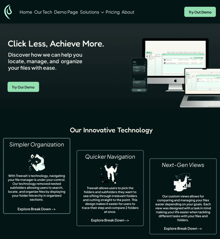
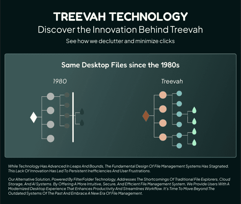
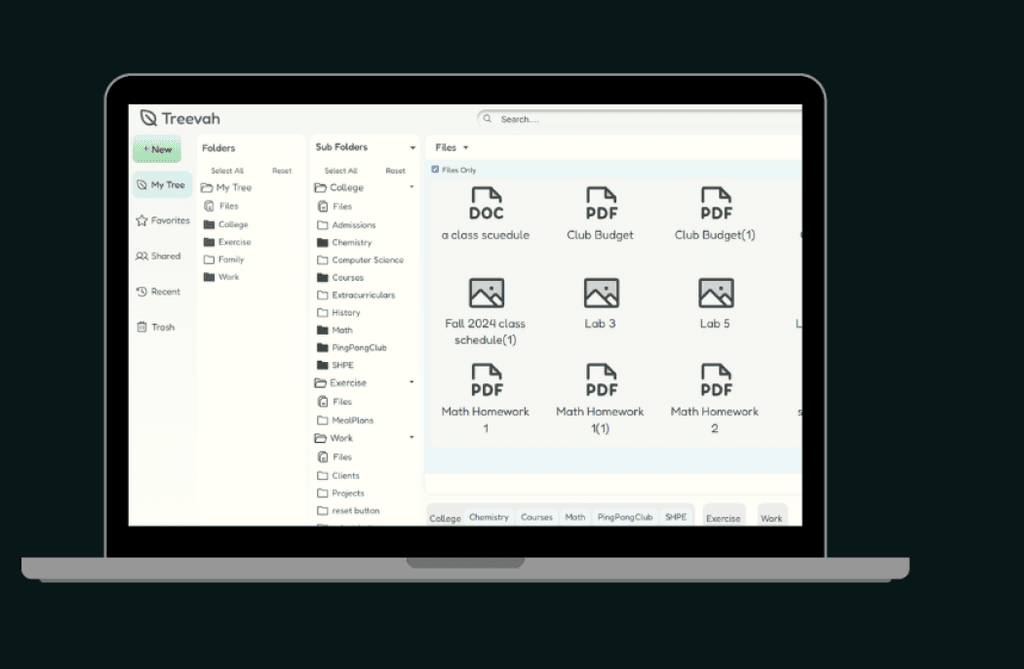
Mobile file management requires too many clicks and scrolls between folders, subfolders, and files to get to the one file you need. There is no filtering system that allows users to quickly navigate folders relieving stress and saving time.
How can we redesign file management on a mobile application with a filtering system to reduce the amount of clicks needed to get to a file ?
Context
Project Management, Mobile Prototyping, & Marketing
Treevah
A startup tech company reimagining file management with a new hierarchy technology
Design
Resume


Lets Connect!
Hope you liked the case!
Check out more of my work here: