Home
About
Contact
Ideation
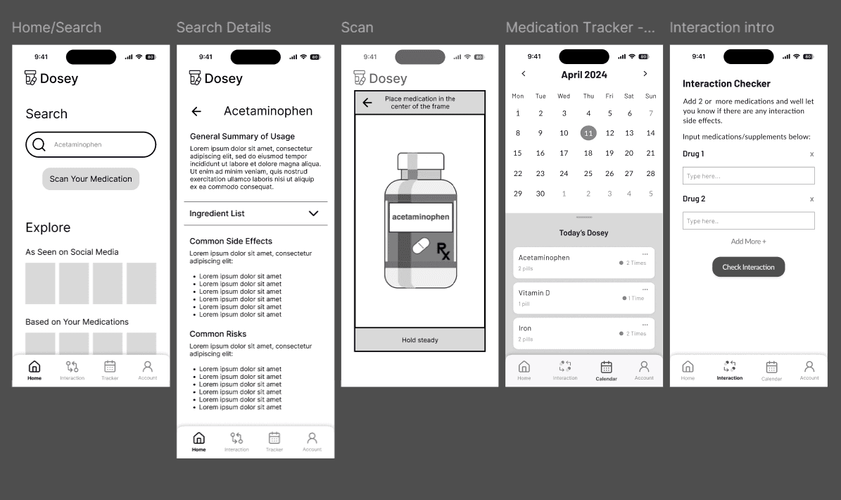
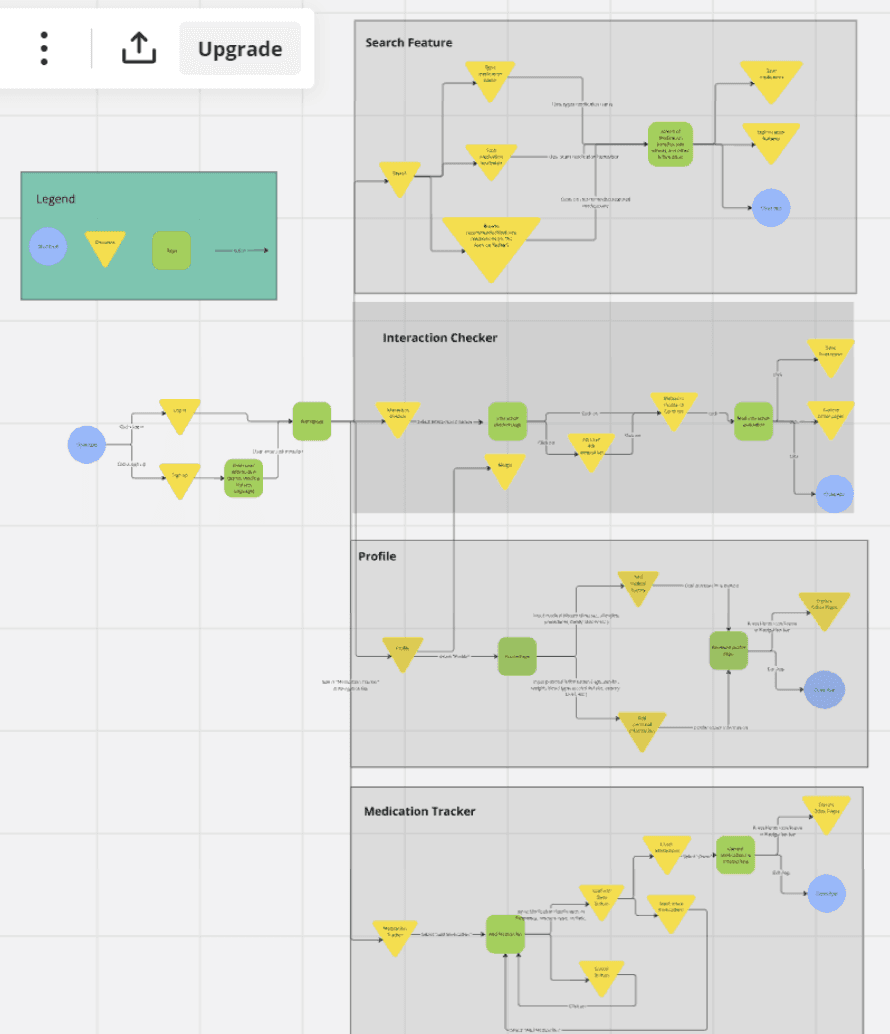
Due to Dosey being a team project we created 40 designs each of what we envisioned Dosey to look like and came together to find the overlaps and create a centralized wireframe to bring into higher fidelity.
The main interactions and pages for this app were the side effect search, medication interaction checker, profile/health history, and medication tracker. We created a detailed user flow and created low fidelity wireframes.
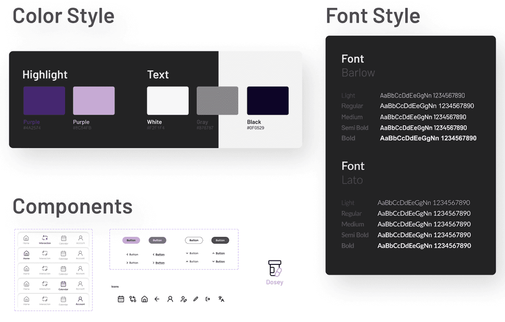
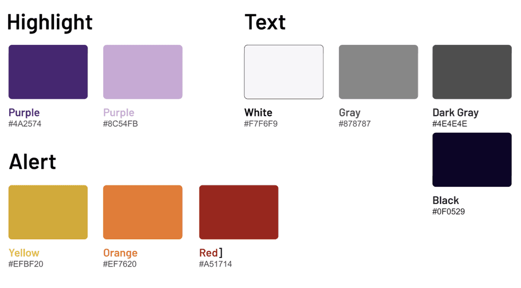
Branding
Accessibility
I voiced concerns with design decision and UI element that didn't always align or consider accessibility, ensuring the final product catered to a larger group of users.
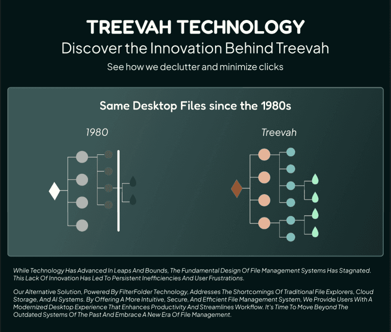
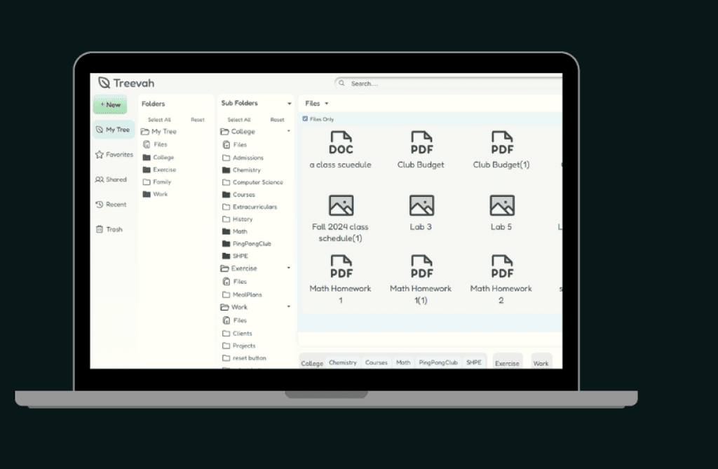
Due to the complexity of Treevah's hierarchy system and the learning curve that is required to get starting with the application, accessibility was our main focus in tone and organization for the app's launch. In the design of the website and the app itself my priory as a project manager was ensuring the product was easy to understand.
Problem
The current Process for patents looking for more information on about their medication is a quick google search or calling to ask their doctor (who will likely give them a shortened version of all the side effects).
How can we create an accessible and informative app for patients to easily retrieve and understand information about their medication?
Context
User Research, Mobile Prototyping, & UI Design
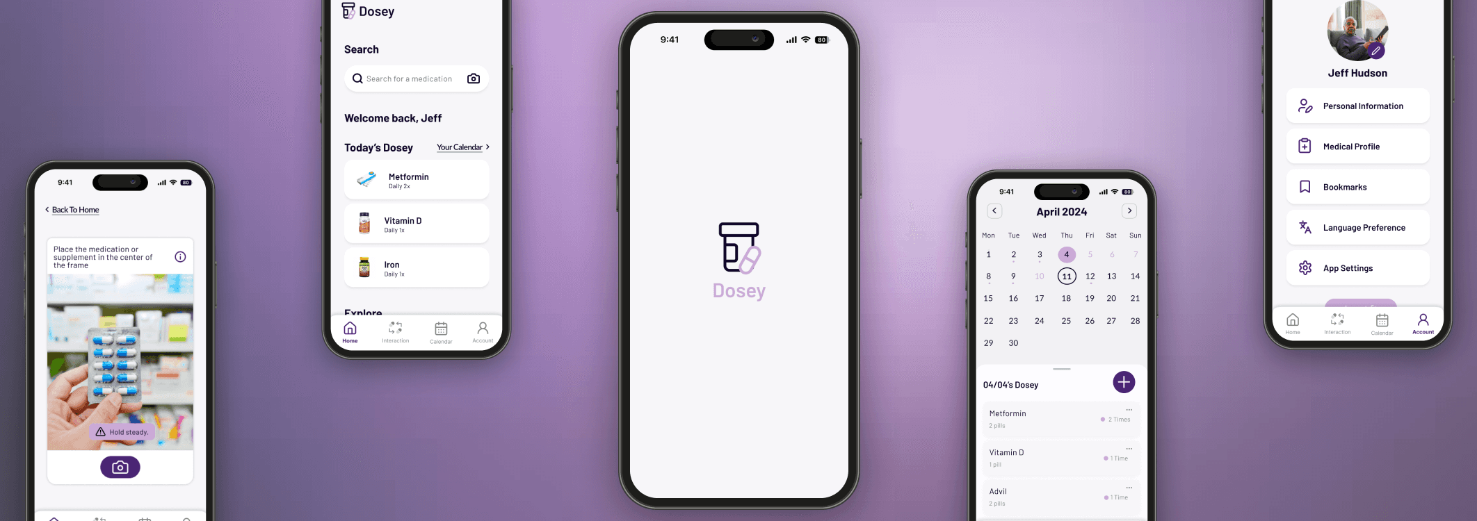
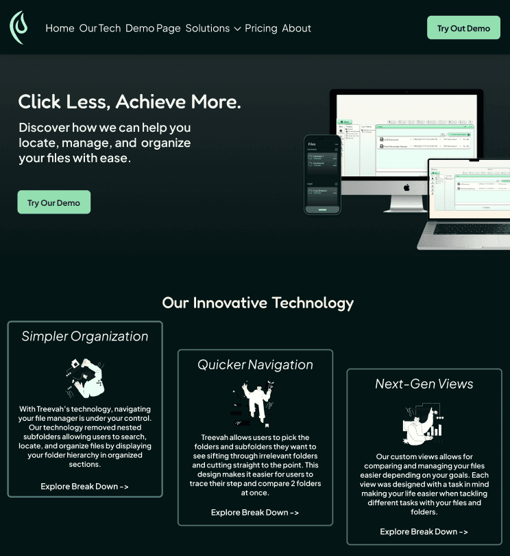
Dosey
A medication literacy app rooted in accessibility allowing users to customize their responses based on their health history.
Design
Resume


Lets Connect!
Hope you liked the case!
Check out more of my work here: